Haglunds
The construction of a brand identity.
The construction of a brand identity.
The construction of a brand identity.
The construction of a brand identity.
The construction of a brand identity.
Haglunds is a comprehensive construction and service company with excellence in retail and service trade with clients such as 7-Eleven, Pressbyrån, Gateau amongs others. Adstream was assigned to create a new brand idenity, update their visual communication to lay a foundation for both the web and future visual material. We designed website, service portal, and in the process of it, a digital brand guideline.
Deliverables
Deliverables
Deliverables
Concept
Brand identity
Web design
Development
Launch Site —
Concept
Brand identity
Web design
Development
Launch Site —
Brand identity
Web design
Concept
Development
Launch Site —
Brand identity
Web design
Concept
Development
Launch Site —
Brand identity
Web design
Concept
Development
The logotype is a symbol of construction. It's built up with relatively stiff shapes and we kept a small space between the shapes to maintain an airy but tough feeling. It's made in a positive and negative space, with the icon in an orange accent colour.
The logotype is a symbol of construction. It's built up with relatively stiff shapes and we kept a small space between the shapes to maintain an airy but tough feeling. It's made in a positive and negative space, with the icon in an orange accent colour.

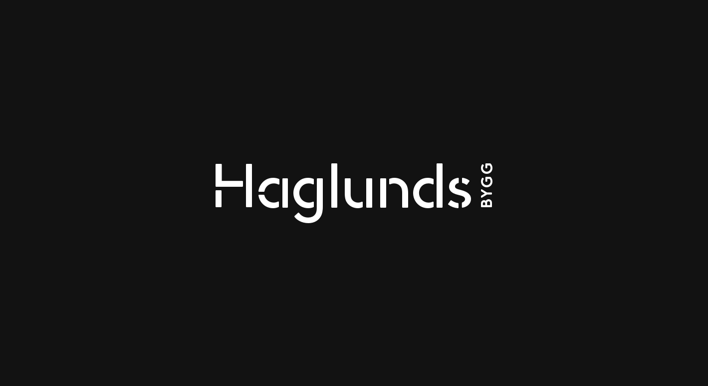
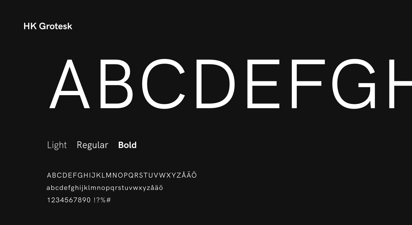
The font we chose is called HK Grotesk and it provides a modern but yet timeless look with clean lines and an unprovocative manner.
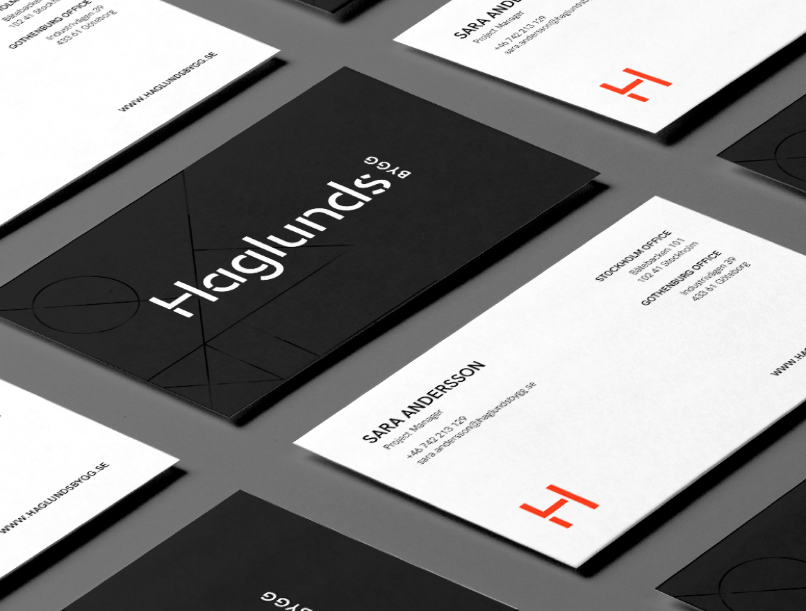
The orange colour has the purpose to levitate the design in different forms such as in the icon or in a disruptive line.
The orange colour has the purpose to levitate the design in different forms such as in the icon or in a disruptive line.

Putting it all together.
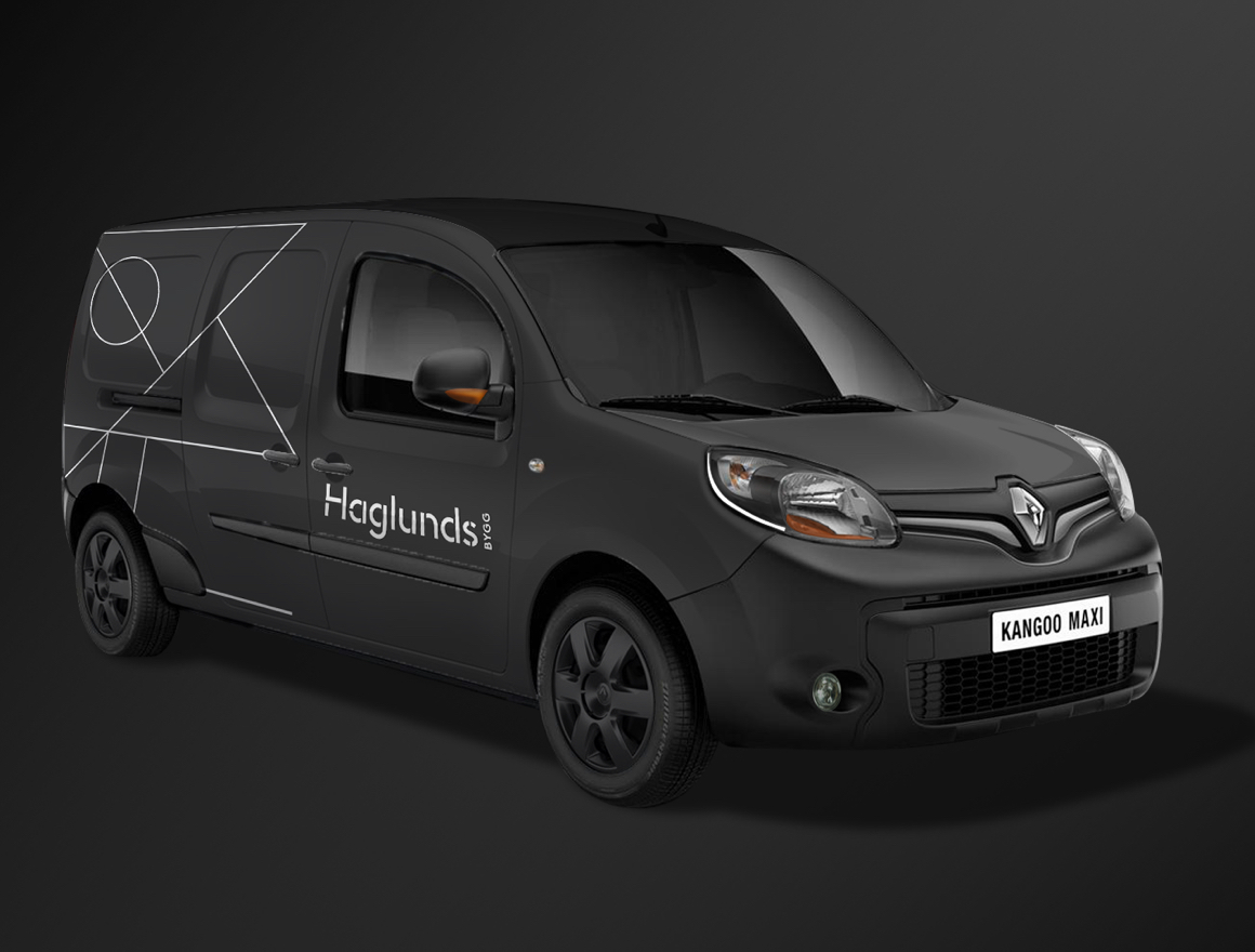
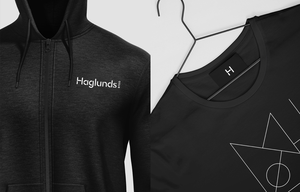
We got inspired by blueprints when creating a perfect graphic element/pattern for Haglunds Bygg. Together with the orange disrupted line, logotype, typefaces and a black background, we dressed the brand with a clear identity that makes them stand out as the professional service provide in their branch.
Let’s connect and talk ideas over a coffee
Pejlingsgatan 13
426 76 Västra Frölunda
Sweden
Business enquiries:
henrik@adstream.se
©2025 Adstream. All rights reserved.
©2025 Adstream. All rights reserved.
©2025 Adstream. All rights reserved.